Friday 14 November 2014

Entry of Faimont Pacific Rim

Week 11: Proxemics, Social and Cultural Behaviours


Image: Fairmont Pacific Rim (Source: Google maps)

When it comes to hospitality design, encouraging social behaviours is just as important as universal design. Socializing guarantees for a better hospitality experience and can even earn the wait staff higher tips. The Fairmont has always been a gold standard when it comes to hospitality and entertaining those that're travelling. But how well does the Fairmont stack up when it comes to accessibility and universal design. Also, what better way to evaluate social and cultural behaviours than at a hotel?

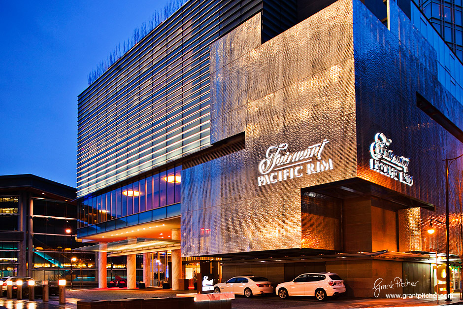
Image: Fairmont Pacific Rim at night (source: Grant Pitcher)

The main entrance to the Fairmont Pacific Rim is directly opened to West Cordova street making the signage very clear to see as you approach. Although the mass of concrete blends with the surrounding buildings, the geometric shape adds strength and weight to the building. Not only that, the concrete mass sticks out from the building and accents the geometric shape. The LED lights illuminate the signage at night that's visible from miles away.

Image: Entrance to lobby (Source: onemileatatime.boardingarea.com)

The main entrance to the lobby is recessed along the curtain wall of glazing but is accented by a black wrap around frame. The entrance is set away from West Cordova making it more private with views to the courtyard. This is a much pleasant entry for everyone as it is more quiet and allow for those in a wheelchair to enter away from the busy street. Although the door staff opens holds open the door for everyone as they come into the lobby, the doors are automated and can be open by pressing a button. The door staff also helps to identify where the main doors are.

Image: In look to the waiting room area (source: ddoctorswivesliving.com)

The courtyard enhances the indoor-outdoor connection especially being so close to the water. The proximity to the water creates a relaxing feeling that transcends cultural and language borders. I don't think theirs any culture that finds the sound of water not calming.

When first arriving in the lobby, the expansiveness of the lobby is kind of overwhelming for those that haven't been here before. The check in/info counter is hard to spot to as it is in the peripherals of your eye when you first walk in. The check in counter is very easy to miss and is recessed into the side of the hall. The contrast in materials and the repetition of the solid mass however help differentiate the services offered at the hotel among the social/restaurant spaces. The recessed counter with the acoustical materials help deaden the reflective sound in the space and make having a private conversation with the check in staff more comfortable for those with varying hearing abilities. The height of the counter doesn't make it comfortable to interact with the staff (too high for those in a wheelchair, too low to provide any real privacy). This can be uncomfortable for those that value privacy of their information and formality from the staff. The check in counter should provide sociofugal behaviour as private information is being exchanged.

Image: Reception services (source: foodology.ca)

Image: Check in counter (source: onemileatime.boardingarea.com)

There's a clear path to the stairs to the second floor but the elevators are not visible from the hallway unless you explore the space. No signage needed here.

Image: Waiting area right next to check in (Source: onemileatime.boardingarea.com)

The waiting area is adjacent to The Lobby Lounge and Rawbar. The guests can mingle or have a drink with each other while waiting for a taxi. The furniture arrangement leaves ample amount of space for luggage and wheelchair access. The seats are arranged around a coffee table and promote sociopetal behaviours while still respecting personal space. I can see how these seats can be seen as too far apart for those whose culture prefer close contact interactions. The social areas have carpet flooring instead of marble which differentiates the space. There's an easy transition between the marble floor and the carpet with an almost seamless change in material.The carpet is very low pile and doesn't create much friction when rolling over. The whole openness of the waiting/dining area paired with the lighting and comfy seating creates an ample atmosphere for socializing and mingling.

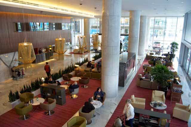
Image: The Lounge Lobby, Rawbar and waiting area (Source: onemileatime.boardingarea.com)

The coloums in the hallway create rhythm in space and divide the space into corridor and social spaces while providing a sense of place for those not wanting to mingle. Marble lines the floor and walls of the hallway and lack contrast for those with varying sight abilities although it does make the space very easy to clean. The grout lines are thin and creates an easy floor to move over. The hallways is quite long and even provides a ledge along the wall to sit while travelling through the space. Signage to restaurant is easily seen from the hallway and provide restaurant goers a clear destination. For those with limited sight capabilities the reflective quality of the marble does make it difficult to navigate the space as light creates glare spots. The openness of this space can make some feel very overwhelmed and uncomfortable. The space is very reflective in light and sound but materials help control these effects. The openness doesn't give a sense of security but anchoring elements (bulkheads, materials, seating arrangements) try to combat the effects of social discomfort.

Image: Reflective flooring and dim lighting (Source: onemileatime.boardingarea.com)

Overall, Fairmont Pacific Rim is a delight to go to for everyone; even for those with varying abilities. The contrast in materials help define the different areas and services. Although for the most part, the Fairmont Pacific Rim is wheelchair accessible and universally designed, there are a few adjustments that can help with accessibility for everyone.

1) Contrast between wall and floor (especially for the marble portion)
2) Brighter lighting overall (although the dimness sets the mood for the social experience)
3) Extra signage to help with wayfinding (especially to find the elevators)


I love hospitality design and The Fairmont is the gold standard for such designs. It's good to see that universal design principles are utilized in the real world and especially for an establishment that has a very wide range of end users all with different abilities, cultures and preferences. The Fairmont is an excellent example of form and function and tries to satisfy both. It pleases everyone's taste even for those of different cultures.

Friday 7 November 2014

The Third Floor From Hell

Week 10: Wayfinding and Crime Prevention


Image: Plan for the 3rd floor Design Section at Richmond Campus (Source: kpu.ca)

If you ever been to the 3rd floor at Kwantlen Richmond, you know what I'm talking about. It is the worst floor I've ever needed to navigate. From the zig-zagging walls and overall sense of claustrophobia, it was terrible to walk through when I was trying to find the microwave. 


As a new student this year from BCIT, the whole building was a maze to navigate. Coming up from the central Rotunda is a very nice experience but after, choosing which corridor to go down is a game of chance. The numbers indicating which rooms are down that corridor help but only works if you know the room number. Trying to find the design lab, sewing lab or microwave is difficult as there may not be a specific room (or is not often referred to as their room number). 


So it was my first full day at Kwantlen and I needed to heat up my lunch. Originally, I was suppose to have lunch with a bunch of other people but I decided that I needed to find the microwave on the third floor so I can skip the lineup at the one downstairs at the KSA, I was told that it was on the third floor next to the sewing lab at the end of the hall and that I can access it from the fire exit stairs next to the Fashion Department. I went down the hall, went up the fire exit stairs and pulled open the door to find myself at an end of the hall. 


In retrospect, I now know that the microwaves are in the student lounge right next to the fire stairs. However, during that trip I thought I was at the end of the hall and that the microwave was at the other end because the opening to the student lounge was tight and squishy. The slanted wall that leads into 3082 looked like an opening towards another path instead of a classroom. The wall of the corridor were so narrow and tight. It didn't feel nice to walk through as it was dark and lack natural light. The doors to the private offices were open and felt like an extension of the hallway. I didn't realize I was in a semi-private space until I read the name plates on the room. 
Image: Door to the private offices is always open

Image: Private offices for administration for the design department

Thankfully, no one saw me wander into the admin area. I turned around and saw the arrow pointing to another corridor. I thought that the elusive microwave must be done that way. I mean where else could it be? The walls down that path were super close and I felt really claustrophobic. I followed down that wall way and ended up in the central rotunda. I was confused how I even got there. There was another corridor leading into a different branch of the building. I went down that one and ended up in the design lab. I was utterly confused about where it was.

Image: I just found out that there's a microwave in the printer area. I thought that printer space was private! 

I decided to go back to the fire escape to double check the area around the fire escape again. I knew I didn't actually peek into the space beside the fire escape. I headed to the original fire escape again to check it out. And this is what I saw:

Image: Student lounge space
Where was the microwave? I found the design lab but where could I heat up the food? I decided to look closer.

Image: Oh what's this?
Image: There it is!


I was super frustrated by the time I found the microwave. I spent a good half an hour trying to find it. I wander around the halls of the third floor aimlessly while the graphic and product students were staring at me. However, finding the microwave did give me an overwhelming sense of happiness and pride. Maybe that's why men don't ask for directions when they're clearly lost; because pride. 

To make this an easier process, I wish someone actually went with me so I didn't have to try to find it myself. There should be signage to state where the student lounge was. I didn't even know that it was a student lounge. It was a cramped corner that looked more like a study area than one where food was to be eaten. The built environment doesn't assist in navigating either. The lack of natural light and views to the outside makes the users lose track of orientation to building/outside. I didn't know how the graphics hallway related to the Rotunda. 

But what would be the best help was providing students with more microwaves at the KSA or other obvious food areas. I'm aware that the school has a contract with Tim Hortons and providing microwaves wouldn't be encouraging sales. However, having 1 microwave for for the general student population is ridiculous. The school is obviously pushing for sales at these unhealthy chain franchises rather than advocating for healthier eating (IE. Grassroots cafe). Especially with the food court at Lansdowne mall and Richmond Center a couple of minutes away, the school needs to push harder for healthier eating. This may not directly be a Human factors issue, but it promotes harm to users as it breeds unhealthy habits. 

Friday 31 October 2014

Myths about Universal Design

Week 9: HF Audit Criteria


Image: Universal Design (source: http://www.levcobuilders.com/)

With the kitchen audit assignment underway, I thought I'd take the time to write about the many myths surrounding universal design and why they are not true. Making our society more universally accessible and usable benefits all users, not just those that are deemed "disabled". Universal design proposes a progressive way of thinking and an approach to develop an inclusive environment that can be accessed, understood and used to the greatest extent possible. Universal design forces the built environment to be used 100% at max efficiency and coming from a trades school, I'm all about efficiency


Image: Universal Design concept and the 7 principles (source: http://claudinecasabonne.com/)

So to help along the ultimate goal of universal design, I thought I'd debunk the top 3 myths about it:


1) UD is ugly

Image: Ugly example of a wheelchair accessible washroom (source: Jeff Schmidt)
Image: What UD can be (source: cargocollective.com)
The most prevalent myth about UD is that the design of it is ugly and unattractive. The truth is aesthetics has a part in usability and how easy it is for the user to understand how to use it. Functionality is important but without aesthetics to provide appeal, no one would want to vouch for it. It is the designer's job to combine function and form to create a design that can be used by everyone and still inspire the imagination. UD is all up to the designers, unfortunately too many have failed at furthering the cause by creating such horrendous interior spaces that doesn't appeal to anyone.


2)  UD is for only the disabled, elderly, wheelchair users ... etc..


Image: The pyramid of users (source: http://www.videspieejamiba.lv/)
Image: Increased range of users (Source: eynaimanina.wordpress.com)

A common misconception regarding UD is that only a few members of society can benefit from it. This is untrue as UD aims to benefit 100% of the population by promoting accessible products, services and environments. Especially with an aging population, the preparations we make can benefit the youth of tomorrow. At some point of everyone's life, we will face some form of physical or mental limitation in our ability. UD can make these experiences more positive and hopefully diminish the power these limitations have over our self-esteem. We are all "temporarily-abled."


3) Building codes already address UD 


Image: Building codes don't necessarily cover UD (source: http://www.remaxwest.com)
Image: Pneumatic Vacuum Elevator and main circulation are adjacent to each other (source: http://www.pveelevators.com)

Building codes only address the safety of the building and it's occupants who are physical and mentally abled. It does not take into the needs of those with varying abilities into consideration. Also, building codes provide a "one size fits all" approach that ultimately end up excluding a large portion of the population due to it's ineffectiveness. Building codes may keep us safe but it doesn't address the mental and emotional aspects of the built environment. UD aims to provide the same experiences, activities and services to everyone no matter what their abilities are. UD aims to eliminate alienation of those that are differently abled and to not create exclusion or segregation. Stairs and elevators are a good example of this as many elevators have been known to be located in an obscure location away from the main circulation. This creates exclusion and doesn't provide a positive experience for those who may be using elevator services. 

All in all, the myths surrounding universal design has been perpetuated by ugly designs and those who are misinformed about the issue. Universal design is a human-centered approach to design that supports the user's dignity, rights and privacy. With the advancements in medicine, the age-distribution is changing and with that, design needs to evolve as well. Universal design aims to provide built environments that allow users to live independently or require minimal third party assistance. The increase of technology can hinder a lot of people to participate in a built environment. Technology must be designed with a range of end users in mind and not just the technology gurus of this generation. At the end of it, these myths need to be debunked in order for increased visibility of UD and it's goals. 

Friday 24 October 2014

Universal Design on Translink Buses

Week 8: Accessibility of Transit


On the city of Vancouver website, it states that, "All conventional buses, community shuttles, SkyTrain and Canada Line vehicles, SeaBus, and West Coast Express trains are fully accessible to people of all abilities." This statement is not true since not all buses or stops are wheelchair stops. In June 2012, only 63.5 per cent of bus stops in Metro Vancouver (which encompasses 22 municipalities) were deemed accessible by TransLink. That means 1/3 of the bus stops in Vancouver can't be accessed by people in wheelchairs. 
Image: New wayfinding signage with raised text and braille (source: http://buzzer.translink.ca/)
Another problem with accessibility is signage and wayfinidng for bus stops. With these new bus signs, even those with limited sight can find the bus schedules and contact information. The contrast of colours make it easier to spot from a greater distance making it a convenient addition to all the bus stops. These extensions along with the bright, yellow, tactile strips around each of the bay stops make transit more accessible to everyone.

Image: Wheelchair Ramp (source: http://www.insidevancouver.ca/)
One of the challenges of using the transit system is getting on and off the bus in a wheelchair. In the picture, the slope of the grade is relatively flat making rolling up and down the ramp not as straining as it can be. If the difference in elevation of the grade was any more, the action of getting on and off the bus would be incredibly difficult. 


Getting past the farebox...with scratches of course (source: http://buzzer.translink.ca/)
The next challenge once the wheelchair is on the bus is getting past the farebox. If the wheelchair had a narrower footprint, the box would not be any problem. However, it was a motorized chair with 4 wheels like the on in the picture, getting past the box can be a bit of a challenge. You'll probably end up scrapping the paint off the scooter by the time you've parked it in the wheelchair spot. 


Image: The dreaded hook and strap system (source: http://buzzer.translink.ca/)
After the strategic maneuvers and 3-4-5 point turns, the most embarrassing part has yet to come. I haven't had anyone strap me in since I was 5. This hook and strap system to secure the wheels of the wheelchair is archaic and troublesome as it requires the efforts of the bus driver to put them on and off.


Image: Person in wheelchair using the "ironing board" system (source: Oran Viriyincy flickr)

The ironing board method is an easier alternative compared the the hook and strap system. Because the upholstered board protects the back of the head from hitting the metal fixture. It also doesn't need a seat belt securing device that requires to be strapped in. It creates a less awkward experience for the person in the wheelchair and allow for more independence and freedom.

The experience for wheelchair users is an unfriendly one. It's also uncomfortable for mobile passengers as well. Seating arrangements can make the whole transit experience awkward and unpleasant especially with high occupancy. Here's a count down of the worst to best seating arrangements for the rear of the bus. 

 4) The "Footsie War" 
Image: "The war for legroom" formation (Source: http://darylvsworld.files.wordpress.com/)
The worst seating arrangement would the 2 seats facing each other. Not only does it promote confrontation for leg room, it is very uncomfortable to get in and out of. The opportunities for awkward eye contact are plentiful, For those with a sensitive stomach and equilibrium, riding backwards can be nauseating. Also more than 1 person may have to get up and move in order to get out.

3) The Slip and Slide
Image: Slip and slide formation (source: kevinsbusrail.com)


The corridor formation provides a lot of benefits over the others. The under seat space allows for storage of extra bags; and essential for students like me with multiple heavy bags. There's easy access in and out of the seats and doesn't require anyone to move out of the way. However, the cons outweigh the pros for this arrangement. If you're a larger person or carrying extra bags, you'll take up more than one seat. The formation also forces passengers to play eye-tag and avoid awkward eye contact. Also when the corridor fills up with standing passengers, it becomes a wall of people closing in on those sitting down. However the worse of it is that the vinyl seats act as a slide when the bus stops suddenly. Every time the bus brakes I ended up being launched into the acrylic partition.  

2) Corridor Formation
Image: Corridor arrangement (Source: flickr.com)

The corridor arrangement is the improved version of the Slide N Slide. However, the fabric seats are hard to clean and probably harbour tons of bacteria and dirt. They're also less comfortable because there's no cushion and is just an upholstered metal seat.  

1) Pairs Formation

Image: Pairs formation (Source: vancitybuzz.com

The best formation for the back of the bus is the pairs formation. Although the person sitting in the aisle seat may have to get up and move in order for the window seat person to get out. Other than that, this formation allows for ample standing space and under seat storage. The back row seats can be quite uncomfortable for those sitting in the window seat. In addition, chance of awkward eye contact is eliminated.

Overall although there are flaws with the accessibility on Translink, they're making improvements to make it friendly to use for everyone. Hopefully with time, Translink can make there services 100% accessible. Taking transit, for me, will always be an uncomfortable task but there are ways to make it less unbearable. Providing larger bus for rush hour times will allow more people to use the services and allow for more breathing room while lowering hostility between patrons. Once the Compass card is fully implemented, the clunky farebox will (hopefully) be a thing of the past allowing larger wheelchairs to be accommodated while allowing for increased boarding speed. Layouts for seats should be planned for maximum standing room and allow for getting in and out with ease.  

Friday 17 October 2014

Designing Nursing Homes to be Pleasant

Week 7: Universal Design


Having worked in the dining room of a retirement home for about a year, I can tell that how depressed these homes can make the residence there. No one wants to be put in a nursing home or retirement home. Many prefer to age in place in their own homes but can not do so because of it's inaccessibility or cost to make it accessible.


Image: The difference between nursing homes and prisons are very slim (source: Anders Petersen)

Nursing homes have been often compared to prisons with the way it is designed. Many are left unsupervised with a curfew at 10 PM. Meal times and types are preset and don't allow freedom of choice. Limited activities, excursions and family visits make it hard to social and connect with family members. Lack of outdoor activities lead to many being coped up inside and develop physical and mental illnesses.


Image: Depression is rampant among nursing homes and retirement centers (source: dailymail.co.uk)

In this rant, Mr. Baldwin states his frustration with institutional living and how it would be more beneficial for seniors to live in jails. Seniors would have access to hobbies, exercise, unlimited free prescriptions, dental and medical treatments, and wheel chairs. 24/7 video monitoring can provide help instantly for those that fell or need assistance. Guards would check on them every 20 minutes and meals would be brought to them. Access to libraries, weight room, counselling, pool, education would be available to all residence. A board of directors would hear out complaints and guards would have a code of conduct to strictly adhere to.


Image: Seton Villa Building at 3755 McGill St. in Burnaby (source: http://www.setonvilla.com/)

Society and the privatization of nursing homes are to blame for the treatment of those that're institutionalized. The limited access to socialization and activity is similar to being in confinement.
Thankfully, not all nursing homes are this depressing.


Image: The view from Seton Villa Retirement Home (Source: setonvilla.com)


The retirement home that I worked in was one of the better facilities I've seen. Located on top of Burnaby, the views of the city are amazing especially for those near the penthouse suite. Public socializing spaces are placed on the higher floors to ensure everyone has access to these views. 


Image: Socializing space (games room) on the 15th floor. Though the chairs look very uncomfortable, the view is available for everyone to access. (Source: setonvilla.com)

Loads of natural light flood socializing spaces and allow for a happy and upbeat atmosphere. However, the chairs do not look comfortable to sit in for long hours. Also, providing some chairs with arms would be beneficial for those that need some assistance getting out of a seated position.

Image: Reading/socializing area flooded with natural light. Different types of seating allow for varied seating arrangement and cushion firmness. (source: setonvilla.com)

Ample amount of circulation space around the dining areas allow those in wheelchairs to eat with the other patrons. The dining room also becomes a flexible space to host parties and large gatherings. Large windows in the dining hall allow for views to the garden and provide natural light.


They even provide employment opportunities for the residence. The receptionists, landscapers, residence coordinators are all resident at the building. This keeps residence busy and allow those that want to work and find fulfillment

Image: A receptionist answering phones and working the main desk. (source: setonvilla.com)

Nursing homes should be a larger issue within the design community especially with an aging population. Unfortunately the elderly are often than not are forgotten as an end user in the design process. As interior designers we need to keep in mind the range of end users that will use the spaces we design. Homes for the elderly should be designed with function and form since almost all off the retirement homes I've seen look miserable to live in. The dated look of the place in gives one a grim feeling. Inaccessible and non-pleasant nursing homes should be a huge concern as it alienates a large portion of our population.  I can't imagine what living in a home like this would feel like. Paired that with the fact you can no longer take care of yourself can lead to a very depressing end to your life. As designers, our job is to create built environments that doesn't alienate anyone and nursing homes fail to serve who they were designed for. 

Friday 10 October 2014

Smartwatches: Yay or Nay?

Week 6: Anthropometry & Fit


Image: That's a camera at the top. Samsung Gear2 Smartwatch (Source: Samsung.com)


When I first heard of the term "Smartwatch" I was actually really excited about it. It was the start of wearable technology. A collaboration of fashion and technology. Gone are the days where digital watches meant ugly plastic bracelets with LED displays. 

Image: Yea I'm talking about these babies. I wore one of these 24 hours a day in the fourth grade. I never took it off, even in the shower. (source: baby-g.com)


I've always been kind of a watch wearer so the smartwatch would've been a grown-up version of my Baby-G from back in the 90's. But with the new releases from Samsung, Apple, and Google, I'm beginning to lose faith in this over-hyped trend of wearable tech.

Image: Apple IWatch (Source: Apple.com)

First thing I noticed was how impractical these smartwatches were. Trying to jam all the features of a smartphone into a tiny 2x2 screen isn't the way to go. I'm a person with relatively tiny figures and I know I'll have problems trying to press the correct app on that app layout. I can't imagine someone with bigger hands and how they'll be able to activate anything. Not to mention, there's no way of communicating with it. The screen is too small to even attempt to type with and voice recognition has yet to be developed into an efficient benefit on a smartphone. Phone capabilities are the only viable option at the moment but will require you to run a headset from your wrist to your ears. Talk about restriction of movement. Which brings me to my next point...

Image: Using 2 hands for a 1 handed task (Source: Samsung.com)

Let's be honest, who uses 2 hands anymore when they're quickly replying a text? Actually we don't even use all the fingers like typing on a keyboard. We use 1 limb, the thumb, to send all our quick sms replies. The smartwatch is unfortunate in being located on a wrist. Already it is rendering 1 arm just to hold itself up while the other must be used to do anything on it. The action of bring the arm up to seeing level and the other hand having to reach across to use it is a huge range of motion that can cause injuries with repetition. From an injury prevention standpoint, the arms are not in a neutral position which will cause muscle strain with time. And also, since the screen is so tiny, you'll have to squint if you don't bring the closer to your eyes. All of this sounds like the watch will cause repetitive strain injuries just so you can read a text.

Image: Moto 360 Smartwatch (Source: motorola.com)
Especially with an aging population, the watches just aren't as intuitive and as user friendly as the current dominant force in tech; smartphones. 

So what's the deal?

This is where smartwatches have the advantage over smartphones. Because it is so conveniently located on the wrist, this makes smartwatches easier to access. You don't go into your pocket or rummage through your bag to find your phone. With a simple tap from the watch, you can easily unlock your door without having to fumble with your keys, It becomes this universal key that opens everything. 


Image: Moto 360 with Nest temperature app (Source: smartwatchgroup.com)

You can also easily adjust the temperature, lights and music in your home before you even get there. Once you leave the house, electronics that aren't needed will be turned off automatically to save electricity. Of course, all of this can be done on a phone as well, but you'll look totally bond-esque doing all this from a tiny gadget on your wrist. 

Image: Phone call time! (Source:klatzwatch.com)

Depending on the watch, you can get phone capabilities. This watch above from klatz is an indiegogo project where you pull the bracelet off your wrist and hold it up to your ear to make a call. As stupid as this may look, it beats the functionality of the Samsung Gear watches where calls will always be on speakerphone. This would be usefully in a case of an emergency. Home break ins, earthquakes (depending if phone lines are still up), and in the event of a lock down, you can discretely make a call even if your phone is not on you. 

Security is also an area where the smartwatch could trump a smartphone. A smartwatch can give you an instant notification if there are any immediate building hazards such as carbon monoxide or fires. Not everyone check their phones that often so by being directed on the body, a smartwatch can have the potential of saving someone's life. 

At the end of it all, I still don't think the smartwatch trend is ready for the mass market. It's still in the early stages of development and will need a couple of years to develop into the product it wants to be. Once that does happen, smartwatches can have the potential to make life a lot more convenient. Being a universal remote for unlocking doors to paying for coffee, these watches can change what we carry in our bags and pockets. The notion of a key, wallet, and even a phone are slowly disappearing. 

Sources: http://www.smartwatchgroup.com/
http://www.klatzwatch.com/
motorola.com
samsung.com
apple.com
baby-g.com