Week 11: Proxemics, Social and Cultural Behaviours
 |
| Image: Fairmont Pacific Rim (Source: Google maps) |
When it comes to hospitality design, encouraging social behaviours is just as important as universal design. Socializing guarantees for a better hospitality experience and can even earn the wait staff higher tips. The Fairmont has always been a gold standard when it comes to hospitality and entertaining those that're travelling. But how well does the Fairmont stack up when it comes to accessibility and universal design. Also, what better way to evaluate social and cultural behaviours than at a hotel?
 |
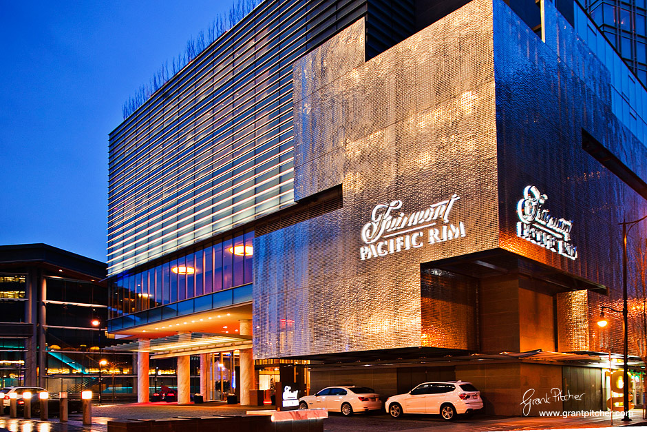
| Image: Fairmont Pacific Rim at night (source: Grant Pitcher) |
The main entrance to the Fairmont Pacific Rim is directly opened to West Cordova street making the signage very clear to see as you approach. Although the mass of concrete blends with the surrounding buildings, the geometric shape adds strength and weight to the building. Not only that, the concrete mass sticks out from the building and accents the geometric shape. The LED lights illuminate the signage at night that's visible from miles away.
 |
| Image: Entrance to lobby (Source: onemileatatime.boardingarea.com) |
The main entrance to the lobby is recessed along the curtain wall of glazing but is accented by a black wrap around frame. The entrance is set away from West Cordova making it more private with views to the courtyard. This is a much pleasant entry for everyone as it is more quiet and allow for those in a wheelchair to enter away from the busy street. Although the door staff opens holds open the door for everyone as they come into the lobby, the doors are automated and can be open by pressing a button. The door staff also helps to identify where the main doors are.
 |
| Image: In look to the waiting room area (source: ddoctorswivesliving.com) |
The courtyard enhances the indoor-outdoor connection especially being so close to the water. The proximity to the water creates a relaxing feeling that transcends cultural and language borders. I don't think theirs any culture that finds the sound of water not calming.
When first arriving in the lobby, the expansiveness of the lobby is kind of overwhelming for those that haven't been here before. The check in/info counter is hard to spot to as it is in the peripherals of your eye when you first walk in. The check in counter is very easy to miss and is recessed into the side of the hall. The contrast in materials and the repetition of the solid mass however help differentiate the services offered at the hotel among the social/restaurant spaces. The recessed counter with the acoustical materials help deaden the reflective sound in the space and make having a private conversation with the check in staff more comfortable for those with varying hearing abilities. The height of the counter doesn't make it comfortable to interact with the staff (too high for those in a wheelchair, too low to provide any real privacy). This can be uncomfortable for those that value privacy of their information and formality from the staff. The check in counter should provide sociofugal behaviour as private information is being exchanged.
 |
| Image: Reception services (source: foodology.ca) |
 |
| Image: Check in counter (source: onemileatime.boardingarea.com) |
There's a clear path to the stairs to the second floor but the elevators are not visible from the hallway unless you explore the space. No signage needed here.
 |
| Image: Waiting area right next to check in (Source: onemileatime.boardingarea.com) |
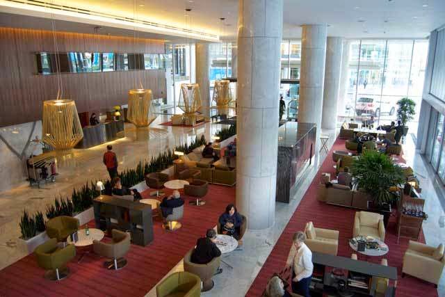
The waiting area is adjacent to The Lobby Lounge and Rawbar. The guests can mingle or have a drink with each other while waiting for a taxi. The furniture arrangement leaves ample amount of space for luggage and wheelchair access. The seats are arranged around a coffee table and promote sociopetal behaviours while still respecting personal space. I can see how these seats can be seen as too far apart for those whose culture prefer close contact interactions. The social areas have carpet flooring instead of marble which differentiates the space. There's an easy transition between the marble floor and the carpet with an almost seamless change in material.The carpet is very low pile and doesn't create much friction when rolling over. The whole openness of the waiting/dining area paired with the lighting and comfy seating creates an ample atmosphere for socializing and mingling.
 |
| Image: The Lounge Lobby, Rawbar and waiting area (Source: onemileatime.boardingarea.com) |
The coloums in the hallway create rhythm in space and divide the space into corridor and social spaces while providing a sense of place for those not wanting to mingle. Marble lines the floor and walls of the hallway and lack contrast for those with varying sight abilities although it does make the space very easy to clean. The grout lines are thin and creates an easy floor to move over. The hallways is quite long and even provides a ledge along the wall to sit while travelling through the space. Signage to restaurant is easily seen from the hallway and provide restaurant goers a clear destination. For those with limited sight capabilities the reflective quality of the marble does make it difficult to navigate the space as light creates glare spots. The openness of this space can make some feel very overwhelmed and uncomfortable. The space is very reflective in light and sound but materials help control these effects. The openness doesn't give a sense of security but anchoring elements (bulkheads, materials, seating arrangements) try to combat the effects of social discomfort.
 |
| Image: Reflective flooring and dim lighting (Source: onemileatime.boardingarea.com) |
Overall, Fairmont Pacific Rim is a delight to go to for everyone; even for those with varying abilities. The contrast in materials help define the different areas and services. Although for the most part, the Fairmont Pacific Rim is wheelchair accessible and universally designed, there are a few adjustments that can help with accessibility for everyone.
1) Contrast between wall and floor (especially for the marble portion)
2) Brighter lighting overall (although the dimness sets the mood for the social experience)
3) Extra signage to help with wayfinding (especially to find the elevators)
I love hospitality design and The Fairmont is the gold standard for such designs. It's good to see that universal design principles are utilized in the real world and especially for an establishment that has a very wide range of end users all with different abilities, cultures and preferences. The Fairmont is an excellent example of form and function and tries to satisfy both. It pleases everyone's taste even for those of different cultures.
No comments:
Post a Comment