Friday 31 October 2014

Myths about Universal Design

Week 9: HF Audit Criteria


Image: Universal Design (source: http://www.levcobuilders.com/)

With the kitchen audit assignment underway, I thought I'd take the time to write about the many myths surrounding universal design and why they are not true. Making our society more universally accessible and usable benefits all users, not just those that are deemed "disabled". Universal design proposes a progressive way of thinking and an approach to develop an inclusive environment that can be accessed, understood and used to the greatest extent possible. Universal design forces the built environment to be used 100% at max efficiency and coming from a trades school, I'm all about efficiency


Image: Universal Design concept and the 7 principles (source: http://claudinecasabonne.com/)

So to help along the ultimate goal of universal design, I thought I'd debunk the top 3 myths about it:


1) UD is ugly

Image: Ugly example of a wheelchair accessible washroom (source: Jeff Schmidt)
Image: What UD can be (source: cargocollective.com)
The most prevalent myth about UD is that the design of it is ugly and unattractive. The truth is aesthetics has a part in usability and how easy it is for the user to understand how to use it. Functionality is important but without aesthetics to provide appeal, no one would want to vouch for it. It is the designer's job to combine function and form to create a design that can be used by everyone and still inspire the imagination. UD is all up to the designers, unfortunately too many have failed at furthering the cause by creating such horrendous interior spaces that doesn't appeal to anyone.


2)  UD is for only the disabled, elderly, wheelchair users ... etc..


Image: The pyramid of users (source: http://www.videspieejamiba.lv/)
Image: Increased range of users (Source: eynaimanina.wordpress.com)

A common misconception regarding UD is that only a few members of society can benefit from it. This is untrue as UD aims to benefit 100% of the population by promoting accessible products, services and environments. Especially with an aging population, the preparations we make can benefit the youth of tomorrow. At some point of everyone's life, we will face some form of physical or mental limitation in our ability. UD can make these experiences more positive and hopefully diminish the power these limitations have over our self-esteem. We are all "temporarily-abled."


3) Building codes already address UD 


Image: Building codes don't necessarily cover UD (source: http://www.remaxwest.com)
Image: Pneumatic Vacuum Elevator and main circulation are adjacent to each other (source: http://www.pveelevators.com)

Building codes only address the safety of the building and it's occupants who are physical and mentally abled. It does not take into the needs of those with varying abilities into consideration. Also, building codes provide a "one size fits all" approach that ultimately end up excluding a large portion of the population due to it's ineffectiveness. Building codes may keep us safe but it doesn't address the mental and emotional aspects of the built environment. UD aims to provide the same experiences, activities and services to everyone no matter what their abilities are. UD aims to eliminate alienation of those that are differently abled and to not create exclusion or segregation. Stairs and elevators are a good example of this as many elevators have been known to be located in an obscure location away from the main circulation. This creates exclusion and doesn't provide a positive experience for those who may be using elevator services. 

All in all, the myths surrounding universal design has been perpetuated by ugly designs and those who are misinformed about the issue. Universal design is a human-centered approach to design that supports the user's dignity, rights and privacy. With the advancements in medicine, the age-distribution is changing and with that, design needs to evolve as well. Universal design aims to provide built environments that allow users to live independently or require minimal third party assistance. The increase of technology can hinder a lot of people to participate in a built environment. Technology must be designed with a range of end users in mind and not just the technology gurus of this generation. At the end of it, these myths need to be debunked in order for increased visibility of UD and it's goals. 

Friday 24 October 2014

Universal Design on Translink Buses

Week 8: Accessibility of Transit


On the city of Vancouver website, it states that, "All conventional buses, community shuttles, SkyTrain and Canada Line vehicles, SeaBus, and West Coast Express trains are fully accessible to people of all abilities." This statement is not true since not all buses or stops are wheelchair stops. In June 2012, only 63.5 per cent of bus stops in Metro Vancouver (which encompasses 22 municipalities) were deemed accessible by TransLink. That means 1/3 of the bus stops in Vancouver can't be accessed by people in wheelchairs. 
Image: New wayfinding signage with raised text and braille (source: http://buzzer.translink.ca/)
Another problem with accessibility is signage and wayfinidng for bus stops. With these new bus signs, even those with limited sight can find the bus schedules and contact information. The contrast of colours make it easier to spot from a greater distance making it a convenient addition to all the bus stops. These extensions along with the bright, yellow, tactile strips around each of the bay stops make transit more accessible to everyone.

Image: Wheelchair Ramp (source: http://www.insidevancouver.ca/)
One of the challenges of using the transit system is getting on and off the bus in a wheelchair. In the picture, the slope of the grade is relatively flat making rolling up and down the ramp not as straining as it can be. If the difference in elevation of the grade was any more, the action of getting on and off the bus would be incredibly difficult. 


Getting past the farebox...with scratches of course (source: http://buzzer.translink.ca/)
The next challenge once the wheelchair is on the bus is getting past the farebox. If the wheelchair had a narrower footprint, the box would not be any problem. However, it was a motorized chair with 4 wheels like the on in the picture, getting past the box can be a bit of a challenge. You'll probably end up scrapping the paint off the scooter by the time you've parked it in the wheelchair spot. 


Image: The dreaded hook and strap system (source: http://buzzer.translink.ca/)
After the strategic maneuvers and 3-4-5 point turns, the most embarrassing part has yet to come. I haven't had anyone strap me in since I was 5. This hook and strap system to secure the wheels of the wheelchair is archaic and troublesome as it requires the efforts of the bus driver to put them on and off.


Image: Person in wheelchair using the "ironing board" system (source: Oran Viriyincy flickr)

The ironing board method is an easier alternative compared the the hook and strap system. Because the upholstered board protects the back of the head from hitting the metal fixture. It also doesn't need a seat belt securing device that requires to be strapped in. It creates a less awkward experience for the person in the wheelchair and allow for more independence and freedom.

The experience for wheelchair users is an unfriendly one. It's also uncomfortable for mobile passengers as well. Seating arrangements can make the whole transit experience awkward and unpleasant especially with high occupancy. Here's a count down of the worst to best seating arrangements for the rear of the bus. 

 4) The "Footsie War" 
Image: "The war for legroom" formation (Source: http://darylvsworld.files.wordpress.com/)
The worst seating arrangement would the 2 seats facing each other. Not only does it promote confrontation for leg room, it is very uncomfortable to get in and out of. The opportunities for awkward eye contact are plentiful, For those with a sensitive stomach and equilibrium, riding backwards can be nauseating. Also more than 1 person may have to get up and move in order to get out.

3) The Slip and Slide
Image: Slip and slide formation (source: kevinsbusrail.com)


The corridor formation provides a lot of benefits over the others. The under seat space allows for storage of extra bags; and essential for students like me with multiple heavy bags. There's easy access in and out of the seats and doesn't require anyone to move out of the way. However, the cons outweigh the pros for this arrangement. If you're a larger person or carrying extra bags, you'll take up more than one seat. The formation also forces passengers to play eye-tag and avoid awkward eye contact. Also when the corridor fills up with standing passengers, it becomes a wall of people closing in on those sitting down. However the worse of it is that the vinyl seats act as a slide when the bus stops suddenly. Every time the bus brakes I ended up being launched into the acrylic partition.  

2) Corridor Formation
Image: Corridor arrangement (Source: flickr.com)

The corridor arrangement is the improved version of the Slide N Slide. However, the fabric seats are hard to clean and probably harbour tons of bacteria and dirt. They're also less comfortable because there's no cushion and is just an upholstered metal seat.  

1) Pairs Formation

Image: Pairs formation (Source: vancitybuzz.com

The best formation for the back of the bus is the pairs formation. Although the person sitting in the aisle seat may have to get up and move in order for the window seat person to get out. Other than that, this formation allows for ample standing space and under seat storage. The back row seats can be quite uncomfortable for those sitting in the window seat. In addition, chance of awkward eye contact is eliminated.

Overall although there are flaws with the accessibility on Translink, they're making improvements to make it friendly to use for everyone. Hopefully with time, Translink can make there services 100% accessible. Taking transit, for me, will always be an uncomfortable task but there are ways to make it less unbearable. Providing larger bus for rush hour times will allow more people to use the services and allow for more breathing room while lowering hostility between patrons. Once the Compass card is fully implemented, the clunky farebox will (hopefully) be a thing of the past allowing larger wheelchairs to be accommodated while allowing for increased boarding speed. Layouts for seats should be planned for maximum standing room and allow for getting in and out with ease.  

Friday 17 October 2014

Designing Nursing Homes to be Pleasant

Week 7: Universal Design


Having worked in the dining room of a retirement home for about a year, I can tell that how depressed these homes can make the residence there. No one wants to be put in a nursing home or retirement home. Many prefer to age in place in their own homes but can not do so because of it's inaccessibility or cost to make it accessible.


Image: The difference between nursing homes and prisons are very slim (source: Anders Petersen)

Nursing homes have been often compared to prisons with the way it is designed. Many are left unsupervised with a curfew at 10 PM. Meal times and types are preset and don't allow freedom of choice. Limited activities, excursions and family visits make it hard to social and connect with family members. Lack of outdoor activities lead to many being coped up inside and develop physical and mental illnesses.


Image: Depression is rampant among nursing homes and retirement centers (source: dailymail.co.uk)

In this rant, Mr. Baldwin states his frustration with institutional living and how it would be more beneficial for seniors to live in jails. Seniors would have access to hobbies, exercise, unlimited free prescriptions, dental and medical treatments, and wheel chairs. 24/7 video monitoring can provide help instantly for those that fell or need assistance. Guards would check on them every 20 minutes and meals would be brought to them. Access to libraries, weight room, counselling, pool, education would be available to all residence. A board of directors would hear out complaints and guards would have a code of conduct to strictly adhere to.


Image: Seton Villa Building at 3755 McGill St. in Burnaby (source: http://www.setonvilla.com/)

Society and the privatization of nursing homes are to blame for the treatment of those that're institutionalized. The limited access to socialization and activity is similar to being in confinement.
Thankfully, not all nursing homes are this depressing.


Image: The view from Seton Villa Retirement Home (Source: setonvilla.com)


The retirement home that I worked in was one of the better facilities I've seen. Located on top of Burnaby, the views of the city are amazing especially for those near the penthouse suite. Public socializing spaces are placed on the higher floors to ensure everyone has access to these views. 


Image: Socializing space (games room) on the 15th floor. Though the chairs look very uncomfortable, the view is available for everyone to access. (Source: setonvilla.com)

Loads of natural light flood socializing spaces and allow for a happy and upbeat atmosphere. However, the chairs do not look comfortable to sit in for long hours. Also, providing some chairs with arms would be beneficial for those that need some assistance getting out of a seated position.

Image: Reading/socializing area flooded with natural light. Different types of seating allow for varied seating arrangement and cushion firmness. (source: setonvilla.com)

Ample amount of circulation space around the dining areas allow those in wheelchairs to eat with the other patrons. The dining room also becomes a flexible space to host parties and large gatherings. Large windows in the dining hall allow for views to the garden and provide natural light.


They even provide employment opportunities for the residence. The receptionists, landscapers, residence coordinators are all resident at the building. This keeps residence busy and allow those that want to work and find fulfillment

Image: A receptionist answering phones and working the main desk. (source: setonvilla.com)

Nursing homes should be a larger issue within the design community especially with an aging population. Unfortunately the elderly are often than not are forgotten as an end user in the design process. As interior designers we need to keep in mind the range of end users that will use the spaces we design. Homes for the elderly should be designed with function and form since almost all off the retirement homes I've seen look miserable to live in. The dated look of the place in gives one a grim feeling. Inaccessible and non-pleasant nursing homes should be a huge concern as it alienates a large portion of our population.  I can't imagine what living in a home like this would feel like. Paired that with the fact you can no longer take care of yourself can lead to a very depressing end to your life. As designers, our job is to create built environments that doesn't alienate anyone and nursing homes fail to serve who they were designed for. 

Friday 10 October 2014

Smartwatches: Yay or Nay?

Week 6: Anthropometry & Fit


Image: That's a camera at the top. Samsung Gear2 Smartwatch (Source: Samsung.com)


When I first heard of the term "Smartwatch" I was actually really excited about it. It was the start of wearable technology. A collaboration of fashion and technology. Gone are the days where digital watches meant ugly plastic bracelets with LED displays. 

Image: Yea I'm talking about these babies. I wore one of these 24 hours a day in the fourth grade. I never took it off, even in the shower. (source: baby-g.com)


I've always been kind of a watch wearer so the smartwatch would've been a grown-up version of my Baby-G from back in the 90's. But with the new releases from Samsung, Apple, and Google, I'm beginning to lose faith in this over-hyped trend of wearable tech.

Image: Apple IWatch (Source: Apple.com)

First thing I noticed was how impractical these smartwatches were. Trying to jam all the features of a smartphone into a tiny 2x2 screen isn't the way to go. I'm a person with relatively tiny figures and I know I'll have problems trying to press the correct app on that app layout. I can't imagine someone with bigger hands and how they'll be able to activate anything. Not to mention, there's no way of communicating with it. The screen is too small to even attempt to type with and voice recognition has yet to be developed into an efficient benefit on a smartphone. Phone capabilities are the only viable option at the moment but will require you to run a headset from your wrist to your ears. Talk about restriction of movement. Which brings me to my next point...

Image: Using 2 hands for a 1 handed task (Source: Samsung.com)

Let's be honest, who uses 2 hands anymore when they're quickly replying a text? Actually we don't even use all the fingers like typing on a keyboard. We use 1 limb, the thumb, to send all our quick sms replies. The smartwatch is unfortunate in being located on a wrist. Already it is rendering 1 arm just to hold itself up while the other must be used to do anything on it. The action of bring the arm up to seeing level and the other hand having to reach across to use it is a huge range of motion that can cause injuries with repetition. From an injury prevention standpoint, the arms are not in a neutral position which will cause muscle strain with time. And also, since the screen is so tiny, you'll have to squint if you don't bring the closer to your eyes. All of this sounds like the watch will cause repetitive strain injuries just so you can read a text.

Image: Moto 360 Smartwatch (Source: motorola.com)
Especially with an aging population, the watches just aren't as intuitive and as user friendly as the current dominant force in tech; smartphones. 

So what's the deal?

This is where smartwatches have the advantage over smartphones. Because it is so conveniently located on the wrist, this makes smartwatches easier to access. You don't go into your pocket or rummage through your bag to find your phone. With a simple tap from the watch, you can easily unlock your door without having to fumble with your keys, It becomes this universal key that opens everything. 


Image: Moto 360 with Nest temperature app (Source: smartwatchgroup.com)

You can also easily adjust the temperature, lights and music in your home before you even get there. Once you leave the house, electronics that aren't needed will be turned off automatically to save electricity. Of course, all of this can be done on a phone as well, but you'll look totally bond-esque doing all this from a tiny gadget on your wrist. 

Image: Phone call time! (Source:klatzwatch.com)

Depending on the watch, you can get phone capabilities. This watch above from klatz is an indiegogo project where you pull the bracelet off your wrist and hold it up to your ear to make a call. As stupid as this may look, it beats the functionality of the Samsung Gear watches where calls will always be on speakerphone. This would be usefully in a case of an emergency. Home break ins, earthquakes (depending if phone lines are still up), and in the event of a lock down, you can discretely make a call even if your phone is not on you. 

Security is also an area where the smartwatch could trump a smartphone. A smartwatch can give you an instant notification if there are any immediate building hazards such as carbon monoxide or fires. Not everyone check their phones that often so by being directed on the body, a smartwatch can have the potential of saving someone's life. 

At the end of it all, I still don't think the smartwatch trend is ready for the mass market. It's still in the early stages of development and will need a couple of years to develop into the product it wants to be. Once that does happen, smartwatches can have the potential to make life a lot more convenient. Being a universal remote for unlocking doors to paying for coffee, these watches can change what we carry in our bags and pockets. The notion of a key, wallet, and even a phone are slowly disappearing. 

Sources: http://www.smartwatchgroup.com/
http://www.klatzwatch.com/
motorola.com
samsung.com
apple.com
baby-g.com


Friday 3 October 2014

A Rant about Parking Rage, Malls, and Cars.

Week 5: Function and Task Analysis

Image: Welcome to parking HELL (sources: panoramio.com)

By far, the worse parking lot I've driven in is Crystal Mall in Burnaby. Whoever decided a circular parking lot was suitable to house rectangular cars needs to be sued asap. There is no way the city approved the plans right? Maybe in an ideal world where all drivers are professionals and cars are no larger than a Corolla, a circular parking lot would be fine. But in Vancouver with the diverse culture, driving ability and types of vehicles, this parking lot just doesn't give anyone an easy time.

Image: Crystal Mall parking stalls (source: vancouverobserver.com)
Image: Is that a parking spot? (source: vancouverobserver.com)

As you can see from the pictures, the parking stalls are arranged in a radial manner. This would be an excellent idea if cars were wedge shapes. Clearly, someone didn't do a thorough enough research on the function and/task analysis or test fits when designing. There's not even a designated pedestrian walkway for patrons to safely get to their cars. Also, the cars are so tightly bud up against each other that it's almost impossible to open the trunk if you backed in (I guess the groceries will need to ride up front). Hopefully they've done a post occupancy evaluation on this and have learned from their terrible terrible mistake. As designers, one of our missions is to not design spaces that can/may cause harm and this is an example of failure, From the steep level changes, turning blind spots and tight circulation space, this parkade is a drivers worse nightmare. 

Image: Nice and cozy (source: youtube.com)


Image: I GOT THIS! I'M ALMOST IN! (Source: youtube.com)
So why bother going to Crystal Mall if their parking is so bad? Because it's a hub for predominantly immigrant Chinese people to gather. If you overlook it's greatest pitfall, it is quite a cozy place to hangout, grab an inexpensive (but possibly bacteria laced) bite to eat and peruse the many interesting gadgets and doodads. The shape of the mall promoted socio-petal activities as the main congregation happens at the grocery area or the food court. Other than that, the mall itself is an endless trap. It's circular shape just connects infinitely which makes getting out of the mall very difficult. Once you're in the mall, you have to make a conscious decision to find a way out. If not, you'll be just like a hamster, going around and around on a wheel. 

Image: Around and around we go (source: thecrystalmall.ca)

Thankfully, I've never been hit by a car but there's just too much risk in designing a circular parkade. Aberdeen Mall in Richmond is also another dangerous parking lot. It's super compact spaces and tight turns aren't forgiving which can cause long lineups trying to get in and out. The circulation is a lot wider which makes 2 way traffic less of a horrifying experience.

Image: Aberdeen Parking (source: vancouverobserver.com)
At least with Aberdeen, there's a lot of clear signage and designated crosswalks, 

Park Royal has a maze of overpasses to allow cars to drive from one parkade to the next. However, on a not so busy day, I've seen these overpasses be treated like one big race course. (source: westvanlibrary.ca)

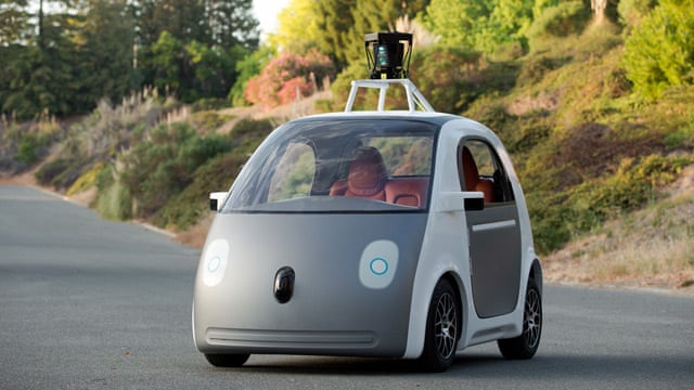
It's a shame that all these malls are being hindered by their parking lots. Retail environments is a place where hostility can occur and it starts in the car, By minimizing parking accidents and hardships, maybe there will be a decline in aggressive customer behaviour? People tend to harbour a lot of free-floating anger from a variety of sources so parking lots aren't 100% to blame. What if we designed a car that prevents road rage or doesn't allow you to drive when you're emotionally distressed? With the creation of driverless cars, this can certainly be possible. 

Image: Google Self-Driving Car (source: thegaurdian.com)

But what's the real problem here? Isn't it cars and urban traffic? 

Driverless cars can definitely aid in the whole sustainable cause as it promotes increase foot-traffic, car sharing and decreased chances of accidents. If we were to combine that with fewer parking stalls, increased bike parking, more accessible transit, theoretically, there would be less car accidents.Maybe the safest future is a car-less one.